Bill_line
Payment system for online business
Industry
Expertise
Personal account redesign, website development and brand identity design
Development period
2023
About the client
Bill_line — is a payment system for online businesses. The team serves online stores, banks, gaming platforms, and other sites with online payments.
The company provides a personal user account with analytics on payments, currencies,
and products to its clients.
Based on this, the client forms a report.
Goal
The Bill_line website has not been updated for a long time, and the logo and visuals are outdated. And personal account settings were difficult even for regular customers. We were given the task of bringing the site up to the level of modern payment systems and simplifying the user account.


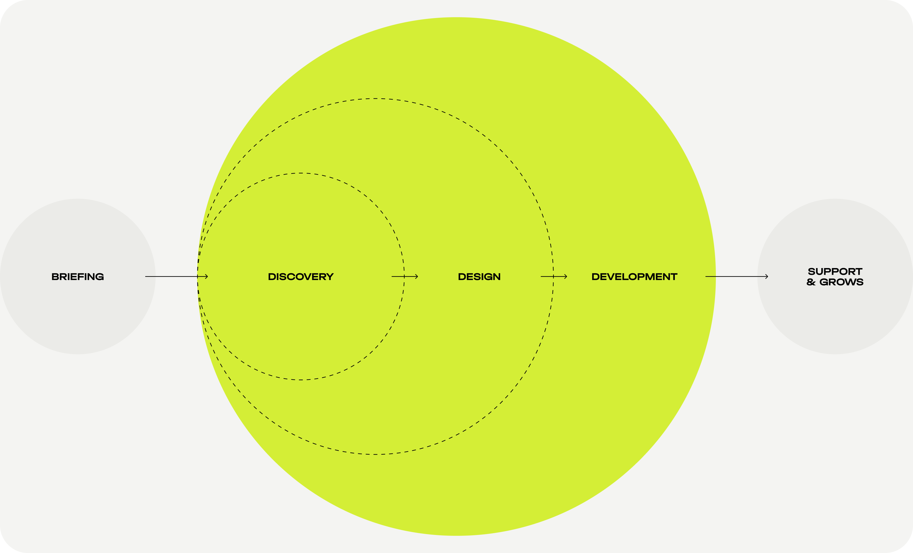
Project strategy
Process
We held a workshop to draw up the project's objectives and find out the client's expectations. During the conversation, it was discovered that
the company does not have a finished brand strategy on the market. So the work had to start with research.
Next, we developed a project strategy:
- Analyzing competitors in the market of payment systems. Development of a brand identity concept
that meets the needs of potential customers and highlights company among competitors. - Development of an identity. Creating a logo that reflects the concept of the company's work.
- Creating wireframes. Agreement on the structure of the future website.
- Creating website design, frontend, and backend implementation.
- Rethinking and redesigning the merchant's account.
Logo & brand identity
The company's logo was very cumbersome: an overflow
of elements, a three-dimensional drawing. We analyzed the competitors' market and identified common features: font logos, and simplification.
Companies provide complex payment solutions, so the design trend is heading toward simplification.
Companies create such logos to be remembered by users at first glance. The client received the results
of working with the concepts in the presentation.
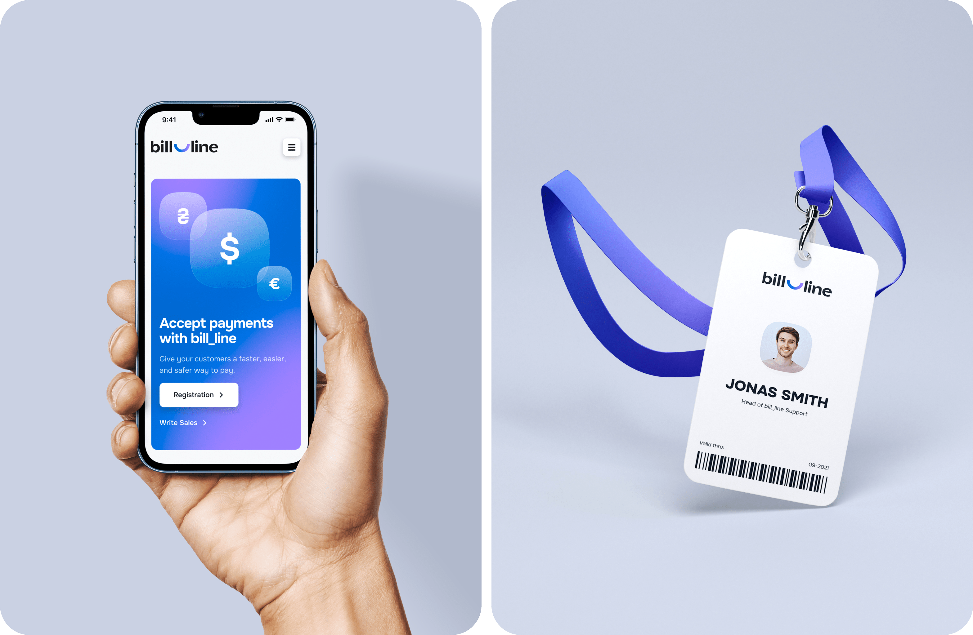
Concepts
We created several concepts from the font of the company name and the line, the leading element of the logo. The line in the concepts symbolizes part of the company's name – Bill_Line.
After consulting with the client, they used the two variants shown in the picture. First, the user
sees the first logo with a straight line (Bill_line). And later, the line is rounded
with the help of motion design. It symbolizes a smile, the main idea
of the new positioning — client care.
Solutions
Two important tasks were accomplished: we simplified
the logo, leaving corporate elements, and we adapted
the logo to the principles of the project — benevolence and customer orientation (by adding a smile to the concept).
Now the logo looks at the level of international competitors, and at the same time, it is adapted to trends.
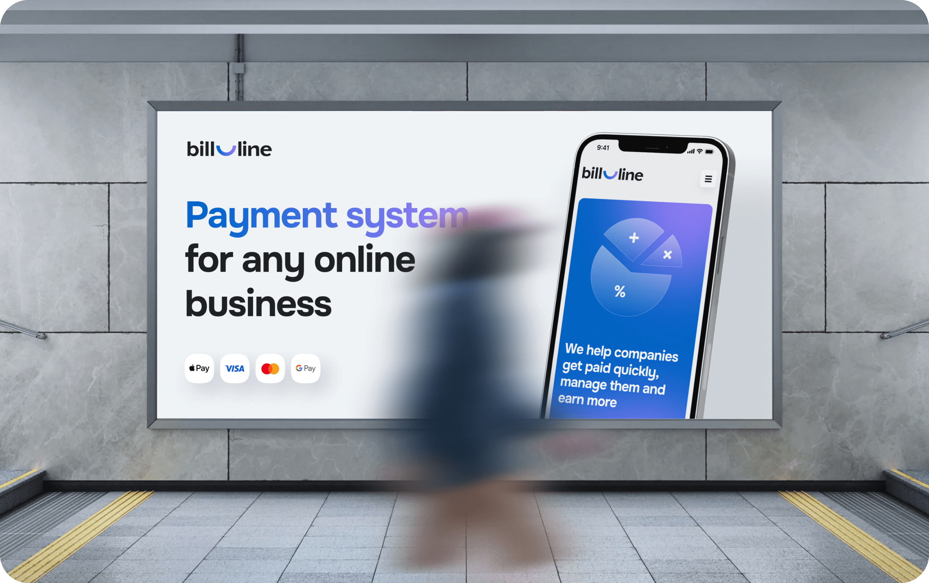
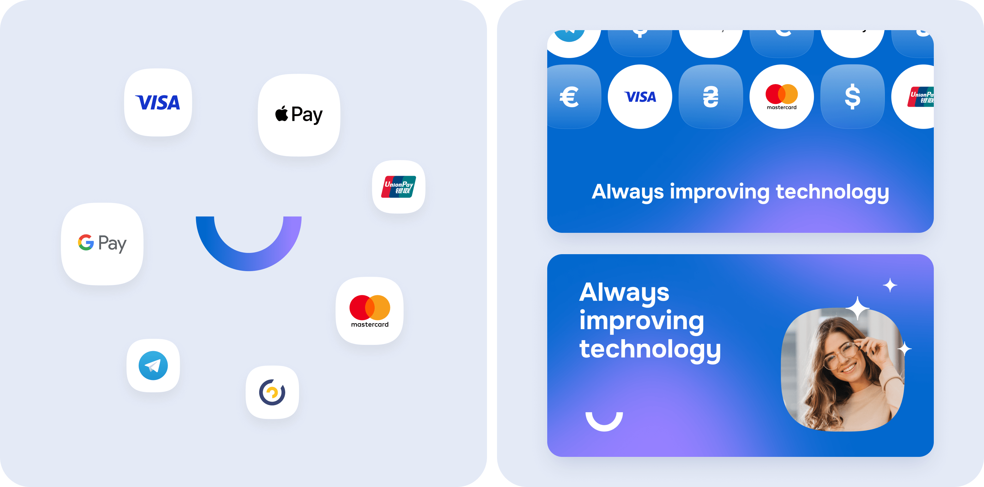
Website development
The design of the Bill_line website pages continues
the identity concept. We used logo colors and brevity. Stylization in motion design was added to the interactive elements.
The peculiarity of motion design is that it loads the site with a weak front-end solution.
Because of this, users wait a long time for the page, or they can close the tab without even waiting
for the first screen.
In each of our projects, motion design is an advantage, not an obstacle. According to Google Page Speed,
our front-end development department achieves a loading speed of 98-99 out of 100. So more often
we add animations through programming rather than using video.
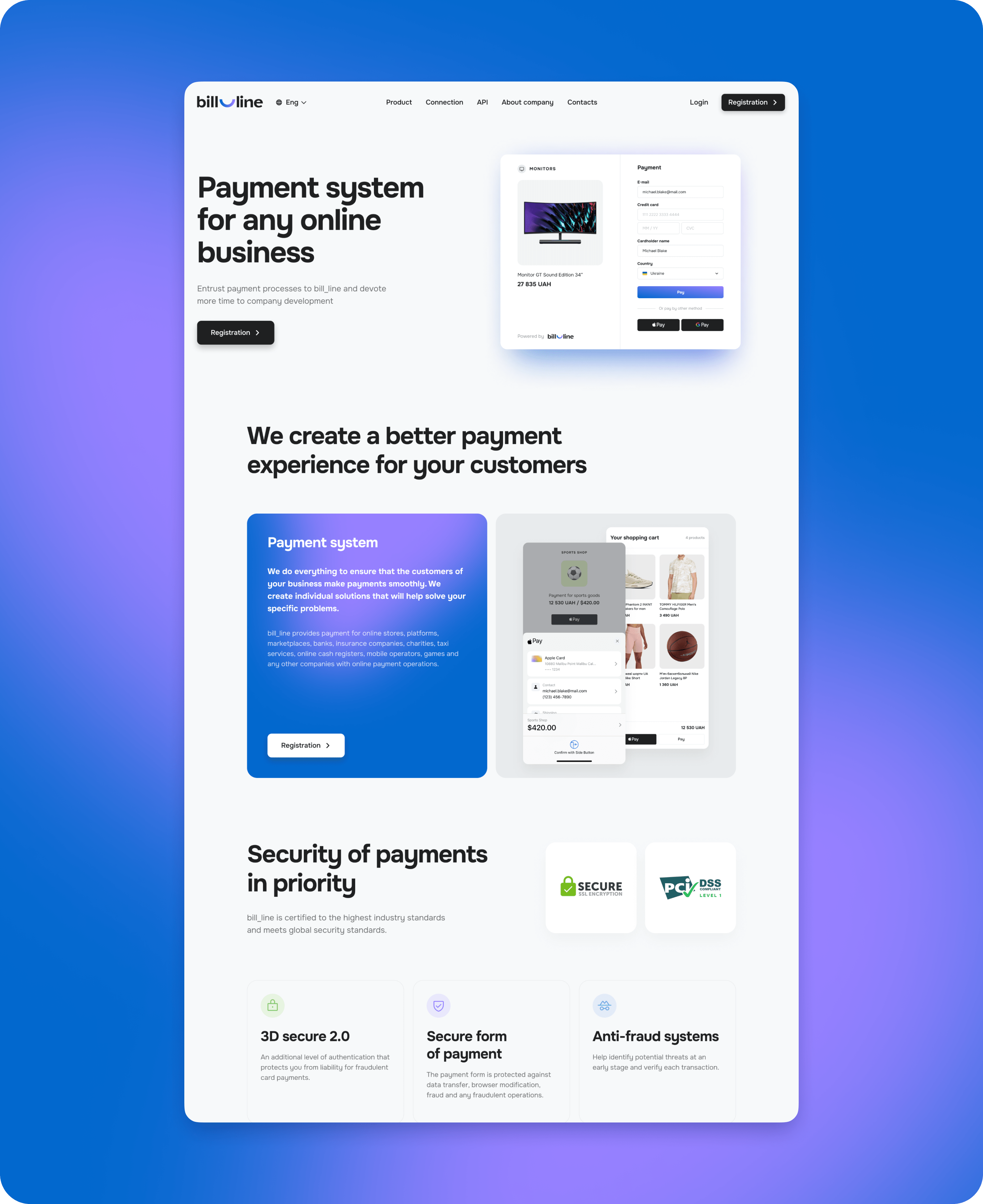
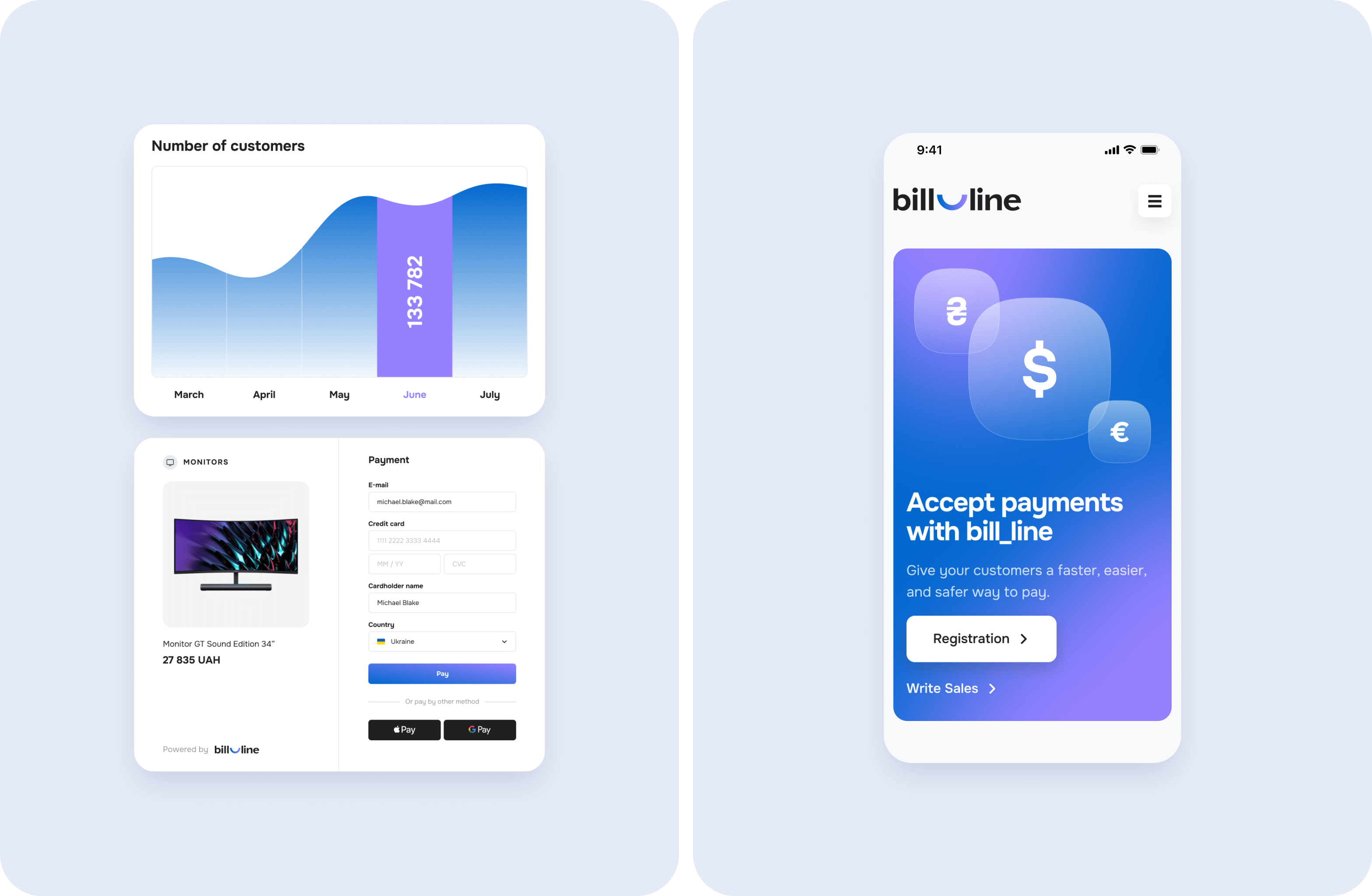
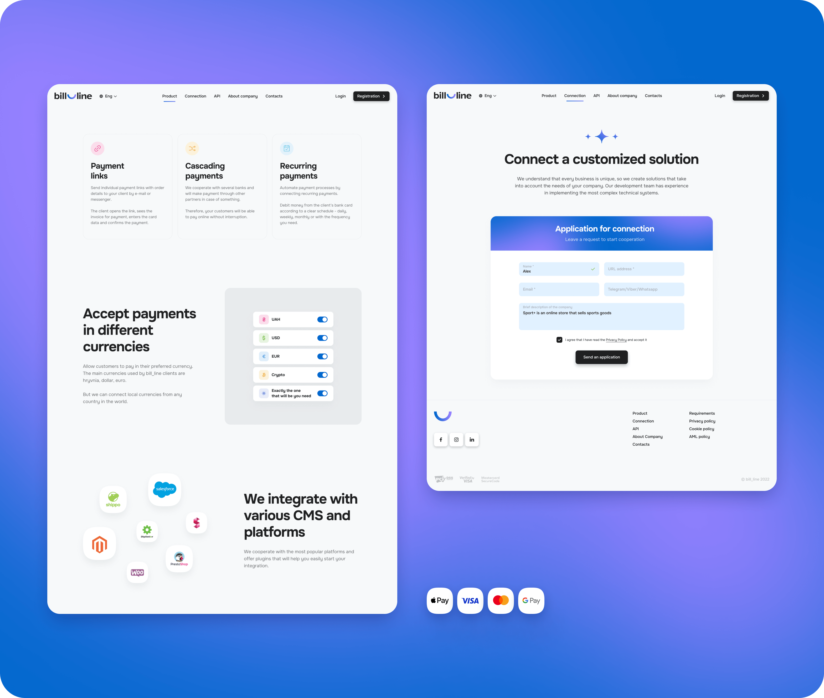
Page design
On each page, the site presents the capabilities
of the Bill_line company to a user. It adapts the client
to the use of the site from the first screen and tells about the main functions, security, and use of the account.
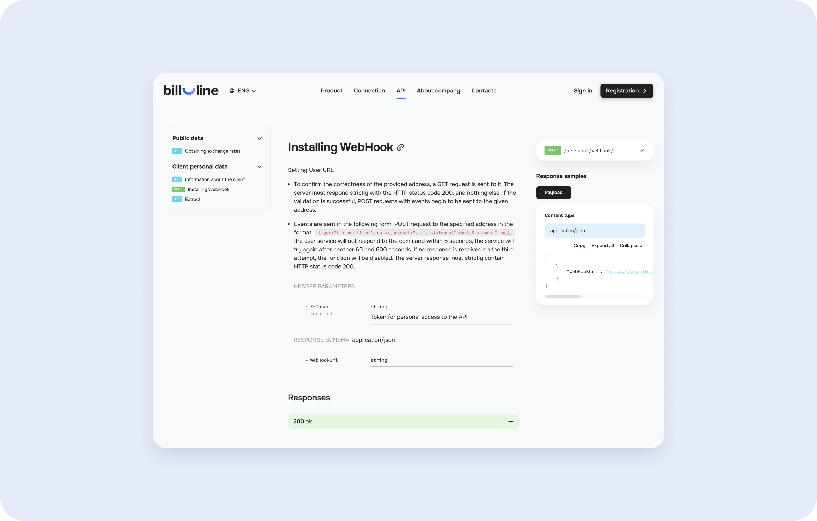
A separate request from the client was to create and style a page to connect the API for user sites.
We have posted detailed and convenient instructions for setting up and connecting the code.
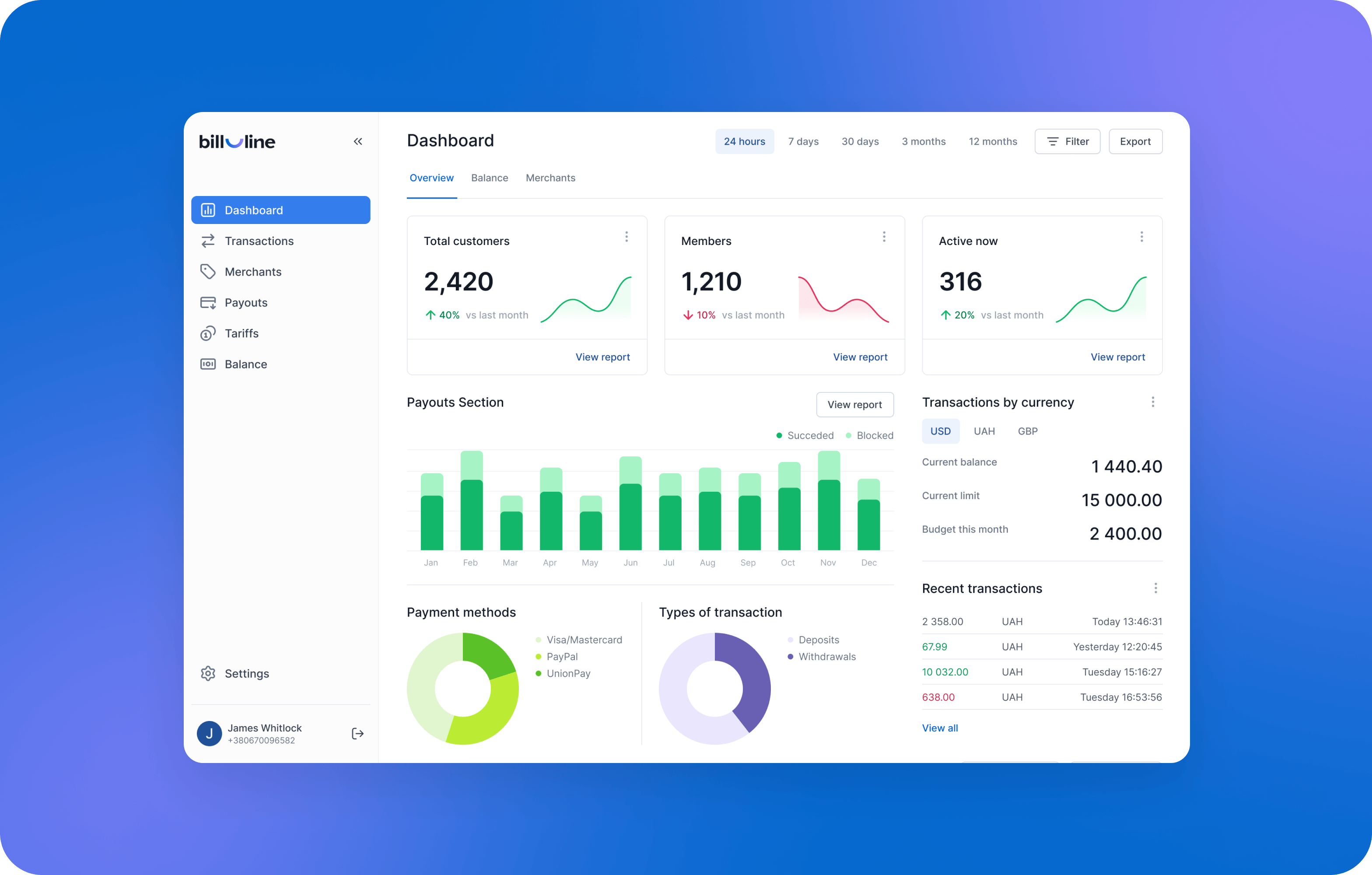
User's Account
In order to adapt the interface to the needs of customers and modern digital traditions, a new concept of FinTech UX/UI design was offered to the client.
The previous User's Account was complicated and not intuitive. The interface did not help
but overwhelmed customers. For instance, it was difficult to go through the registration procedure.
There were no hints in the account on how to manage analytics and reports. The analytical data itself
was piled up and the user had to understand the interface well to operate on the reporting parameters.
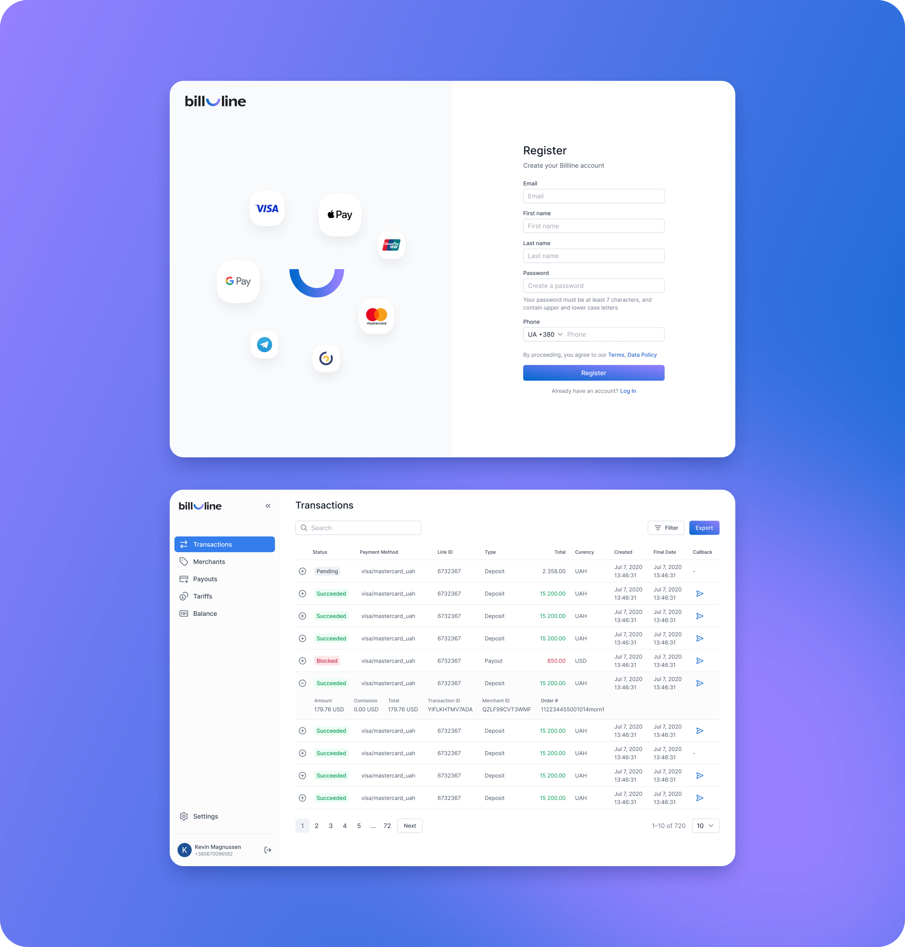
Intuitive interface
At each stage of managing the account, the website gives hints on what each function is for and how to use it correctly. Registration was simplified to the main page, where an explanation was given under each line on what information needed to be entered.
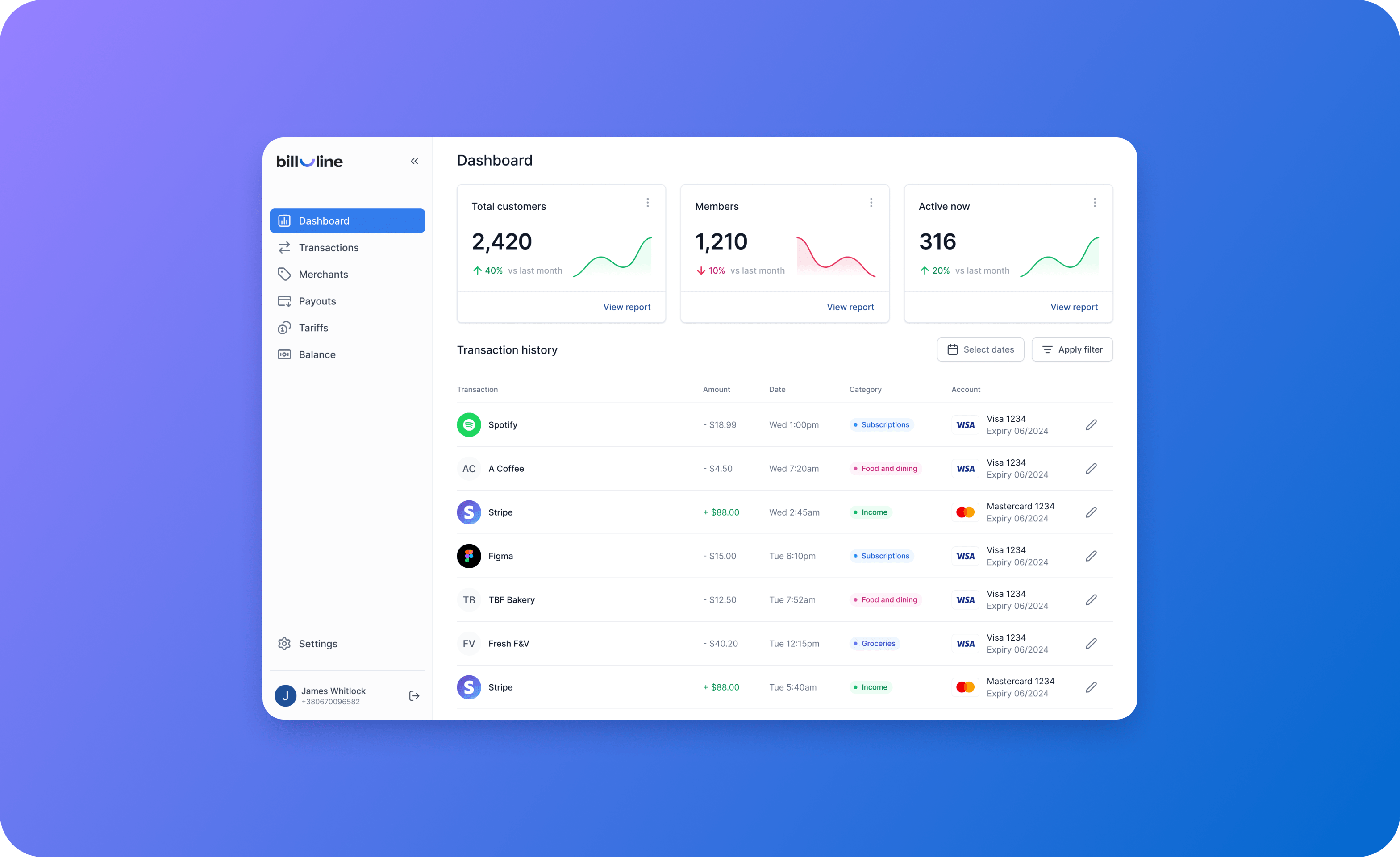
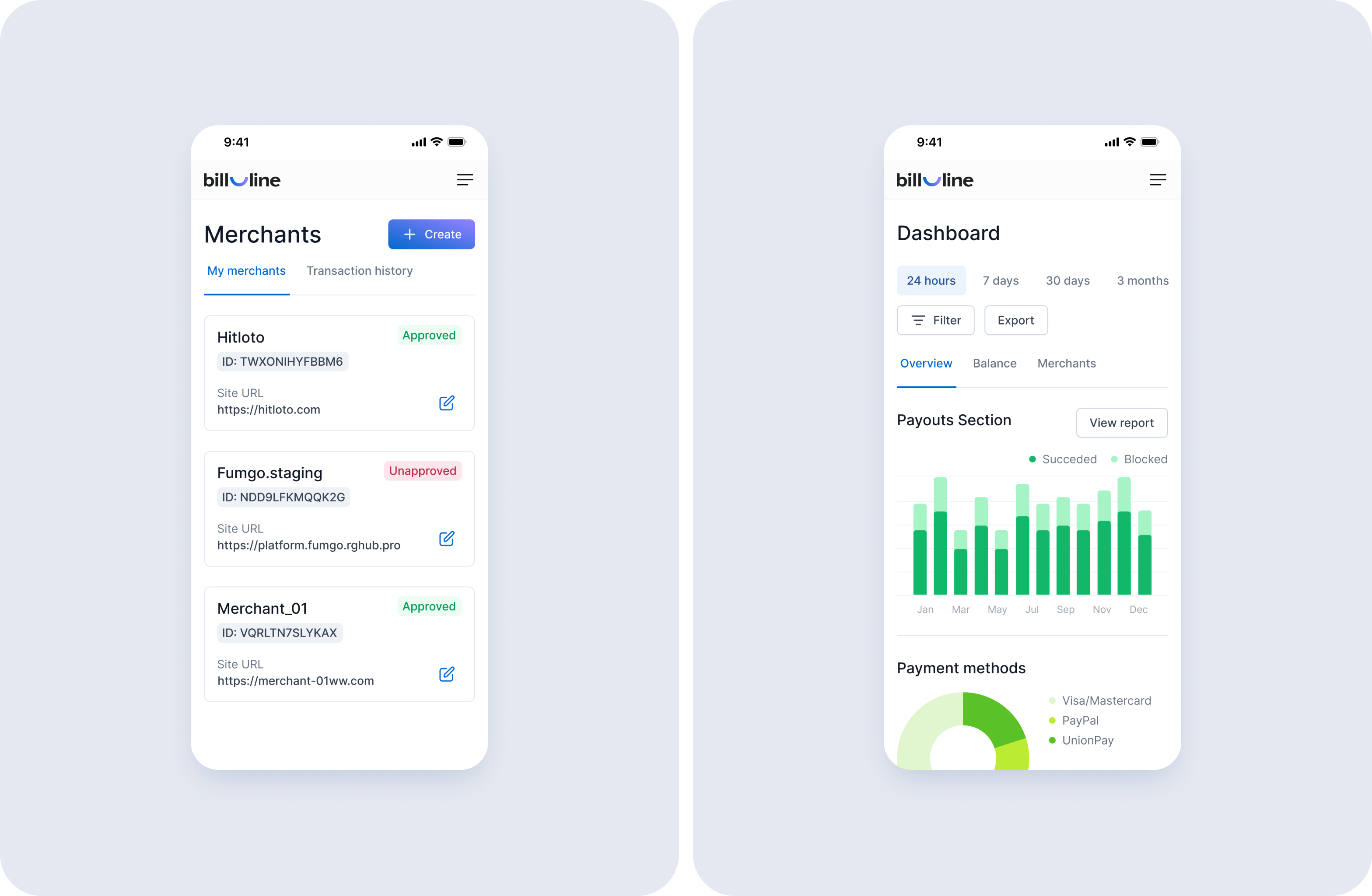
Dashboard
We also created a dashboard concept. Information was placed on it succinctly and clearly, without overloading it with unnecessary elements. Immediately after registration, a newcomer was able to intuitively understand what this dashboard is for and what data it operates on.
The UX/UI of each page has been thought out to the smallest detail. For example, an initial window
with hints, and a page for confirming, changing, and restoring a password were created for the registration page. Screens were presented to the client at Figma.


The results
The result of this project was an updated presentation website and a convenient user's account. The product is adapted to the needs of users and trends of the fintech industry.
Modern logo and brand identity
The brand identity and styling of the site correspond to modern ideas about the quality of the payment system. We focused on the convenience, customer orientation, and security level of working with Bill_line.
Updated presentation website
The new site is simple and easy to use. Interactive hints and instructions have been thought out on every page so that new users can work without technical support or with minimal consultation.
User's personal account
Regular users talk about positive changes: it is easy to monitor analytics in the account, and generate reports for the business. This was also noticed by new clients who were not familiar with the Bill_line product before. And now they use the site every day.
Links
Website
Bill_lineOther projects
Corefy
UX/UI design, website development and brand identity for the scale payment platform

PayAtlas
Platform interface design, website development and logo creation for the global catalog of payment providers

Cascad
Website design and development.
Logo and interface design of a personal account for a payment system
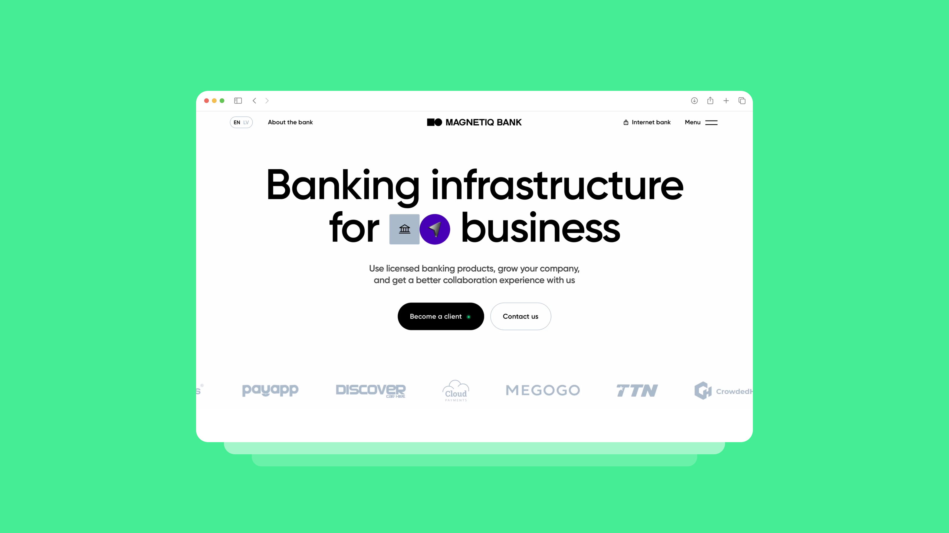
Magnetiq Bank
Website development, UX/UI design and new brand identity for the bank
the best experience for your business together
© Goodface 2026